Author: vizzie
-
Diabetes & Weight Management Rx
Diabetes & Weight Management Rx is a medical clinic in Waltham, MA, that specializes in helping people with their lifestyle and management of diabetes and weight loss. I wanted this logo to exude confidence with a timeless style. In addition to this logo I also assisted the owner of the clinic with producing their business…
-
Farix Embedded
Farix Embedded is a hardware engineering and development consultancy. I was inspired by the angular edges of the traces in a circuit board and machined metal enclosures of hardware designs.
-
Ribon Therapeutics
Ribon Therapeutics is a newly-formed cancer research startup. I helped Ribon take an almost-finished logo and add the final touches that make it a stronger logo. The changes were subtle, but made a big difference. I extended the line over the “ri” to give the logo more balance and call out that the name is pronounced “rye-bon”…
-
Amathus Therapeutics
Amathus came to me based on previous work I had done for other pharmaceutical startups. They wanted a logo to subtly represent the founder’s Greek herritage. We came to use an abstracted version of a Greek key. I delivered two configurations of the logo. One more horizontally-oriented, and a more vertical “stacked” version. I also…
-
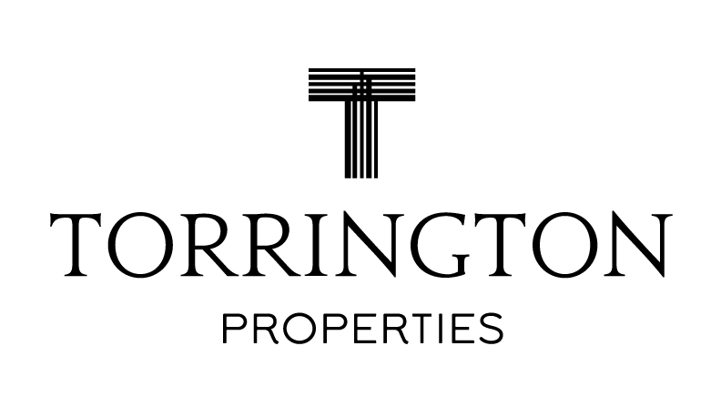
Torrington Properties
Torrington Properties buys and develops commercial and residential spaces. Their work is of high quality and I wanted to reflect that in the logo. The logo graphic represents both the crossing of steel beams and creates the siloutte of a building at the intersection. The owner of the company was so pleased with the logo…
-
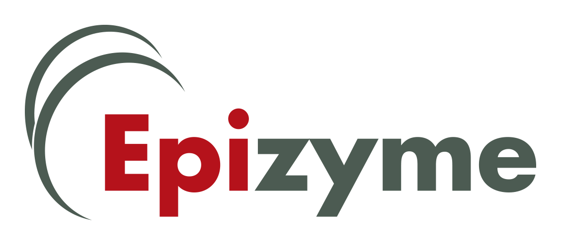
Epizyme
This biotech startup needed a logo that represented their area of study: Epigenetics. The two swooshes in the logo represent how DNA strands wrap around the nucleosome. This is the basis of the study of Epigentics.
-
Stonington Capital
Stonington Capital is a collaboration between a building developer and a finance company to create a financing company focused on helping people buy and renovate houses. For this company I drew inspiration from some old school Boston-area financial companies. I wanted to give their customers a familiar look and feel from the great history of…
-
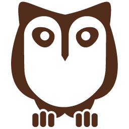
Owl’s Head
Owl’s Head is a marketing consultation company started by a former Timberland shoe executive. He named the company after his favorite mountain to hike in New Hampshire. The owl is also a symbol of foresight and wise insight. The owner of the company is a quirky and fun person so I wanted to have his…
-
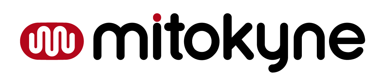
Mitokyne
Mitokyne came to me with a partially-created logo. I helped them hone the idea by making small adjustments to the logotype, changing the container that held the squiggle to look more like a cell, and adjusting the color palette to be more refined.
-
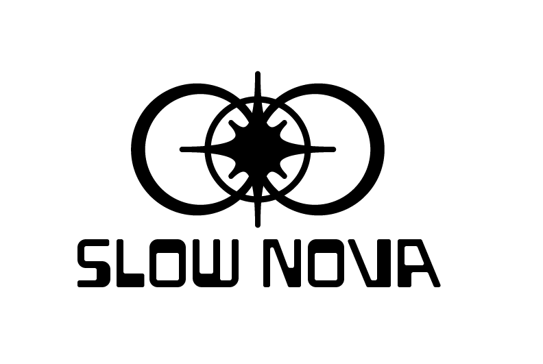
Slow Nova Modules
I made the logo for this company back in 2014. The company is not active anymore, but you can find someone noodling with their synth rig featuring one of the Slow Nova modules (upper rack, just to the left of center). The owner of the company had this vision of a slowly exploding supernova, hence…